Creating LOGO using Adobe Photoshop
Logo is the most important asset of a company. Logo represents your company.
The dictionary meaning of a logo is a symbol, sign, or emblem. Human beings have used such symbols throughout time to convey a succinct message. In present times, logos tend to be graphical in nature, designed for easy recognition of an organization. It is a tool to build an identity for the organization, as part of its trademark or brand, and to generate favourable thoughts and feelings about the organization.
A logo needs to be original and memorable for the greatest impact.
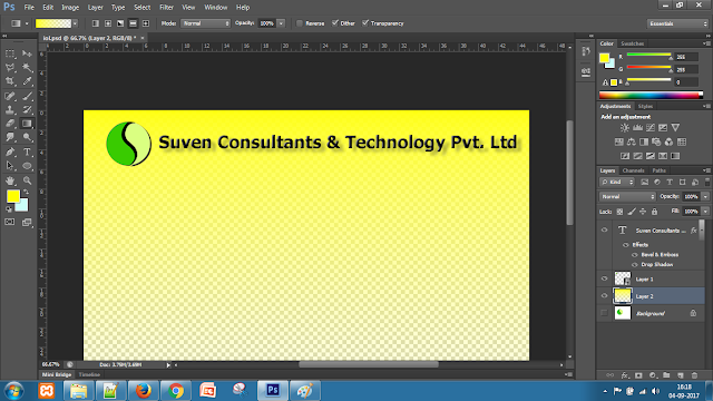
A logo refers to an image that relates to a company. For example, the image to the right, is an example of the Suven Consultants logo.
Features of a Corporate Logo
Identify Target Market
What type of customers are you trying to attract? The success of your company's branding efforts will rely on the customers you are pursuing. Trendy graphics and hip hop music may attract the younger consumer, but this type of advertising might turn off the mature customers. Cater to the interests of your potential clientele.
Legalities
Research your ideas so you do not infringe on another company's brand. Developing your brand is a long term investment. Register your trademark legally to protect your company's name from imposters and possible customer confusion.
Logo and Color Scheme
Choose simple color choices and an easy to read font for your company logo. Choosing a graphic that says something about your business helps in creating your unique brand name. A good example of an effective logo is the swirled red, white and blue Pepsi® circle. The simple logo dominates the cans and bottles it is printed on and the only reading required is to determine if it is regular, flavored, diet or caffeine free.
Celebrity Endorsements
Visual stimulation will help prospective customers remember you. Grab their attention with ads and commercials using a recognized person or character. Hanes® sales increased when Michael Jordan became a spokesperson for their national campaign and television commercials. Small businesses starting out probably cannot hire a famous celebrity like Michael but there are other ways to attract customers and create an identity for your business. Create your own character. Animated celebrities like M&M® candies have been brought to life on television and online ads. If you are directly involved with your customers in a retail environment, you could be the face of your company. If you are uncomfortable using actual photos, consider turning your picture into a cartoon. There are several photo programs that can transform a picture into a sketch with the click of a mouse. You could also hire a professional to animate your likeness and use it on all of your advertising.
Catchy Tag line or Jingle
"You deserve a break today" is not heard as often as it used to be but most people still remember that catchy jingle. That saying became popular before there were fast food restaurants on every corner. It was a treat for a woman to pick up dinner at McDonalds® and not have to cook. What does your company offer that can help the consumer? Your tag line should be short, easy to remember and send a message to your customer. Turn your tag line into a musical jingle and your company will become the brand consumers will remember.
As a final step, drag your gradient layer below all the other layers in the Layers window.
Your logo is now complete!
--------
What We Will Make
We will use Adobe Photoshop CS6 for this tutorial, though you’ll be perfectly fine with older versions of Photoshop as well.
Step 1: Create a New Document
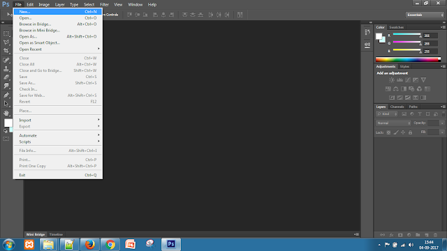
Go to File -> New, or press CTRL+N in Photoshop. Select the appropriate width and height for your design. I like to have a large enough canvas to work with – around 1000px width and 600px height. You can always change canvas size later.
Step 2: Create the Basic Shape
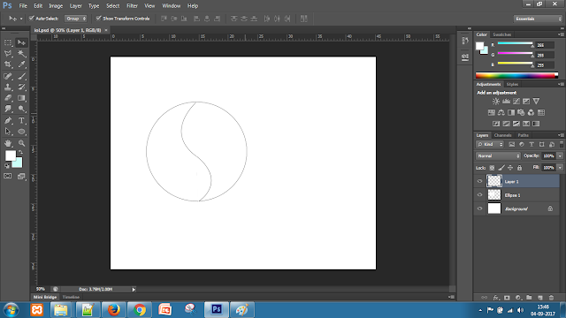
To create the effect that we want, we will make our logo with two overlapping shapes as shown below:
We’re going to use the ‘Pen’ tool to create our shapes. It’s the pen shaped icon on the toolbox to the left.
Now create a new layer. Name it Shape 1. Select the pen tool, select ‘shape’ in the tool properties at the top. Choose a bright red color for the fill (I used #ed1c24).
It’s useful to switch on the grid while drawing. Go to View -> Show -> Grid, or press CTRL + ‘. Create the shape as shown below:
For the second shape, instead of drawing it from scratch, we can simply duplicate the Shape 1 layer and flip it horizontally.
Select the current shape in the layers window on the right. Right click on it and select ‘Duplicate Layer’. Name the new layer Shape 2 you want.
Now select the duplicate layer, go to Edit -> Transform Path -> Flip Horizontal
You should have the following shape now:
Step 3: Change Colors
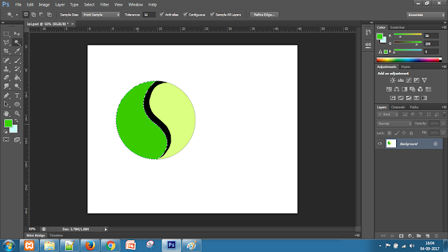
Since we want to create an overlapping ‘Origami’ like effect, we will make one of our shape layers slightly darker in color to give the impression of depth.
Double-click on the Shape 2 thumbnail in the Layers window. The color selection pane should pop-up.
Select a slightly darker shade of color.
While you’re at it, drag the Shape 1 layer on top of the Shape 2 layer in the Layers window as well, such that Shape 2 appears to be behind Shape 1.
Step 4: Creating the Shadow
Duplicate the Shape 1 layer as described above. Name it Shadow Layer Change the color of this new layer to black (#000000). Go to Filter -> Blur -> Gaussian Blur. Choose a radius of 2.75 pixels. Your image should look like this now:
Now drag the Shadow Layer underneath Shape 1 in the Layers window. Right click on Shadow Layer and select ‘Create Clipping Mask’
Your image logo should now have the nice shadow effect.
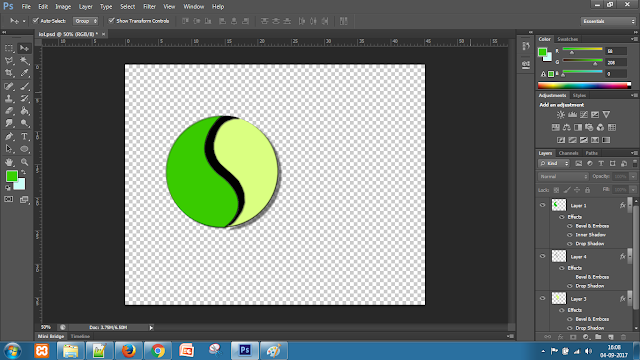
Step 5: Add the Text
We’ll now add text to our logo. Unfortunately, the default Windows font selection isn’t exactly too great. So instead of using tired, stale fonts like Arial, we’ll head over to Google Fonts and download a bunch of new, modern fonts.
For this project, I recommend downloading Raleway. This is just a personal preference though. You can choose any one of the hundreds of free fonts on Google Fonts. Some of my personal favorites are:
- Open Sans
- Roboto
- Ubuntu
- Exo
- Lobster
- Bevan
I choose Arial with font-weight of ‘bold’ and a font-size of 200px. Feel free to experiment with this if you want.
Place the text below the logo. For a bit of extra effect, add a drop shadow to the text. Right click on the text layer, select ‘Blending Options’. In the window that pops up, choose ‘Drop Shadow’ and pick the parameters:
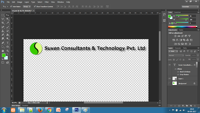
Step 6: Add a Background Gradient
This is the final step to give our logo a bit of dramatic flair.
Click the ‘Create New Fill or Adjustment Layer’ button at the bottom of the Layers Window.
Choose ‘Gradient’. In the window that pops up, select ‘Radial’ under Style. Make sure to check the ‘Reverse’ option at the bottom.
Now, double click on the gradient color in the window. The gradient edit window will pop up. Play around with the colors and settings for a while until you find something you like.
